NEWS
Android 17 Pause Point Turns Screen Time Into Friction
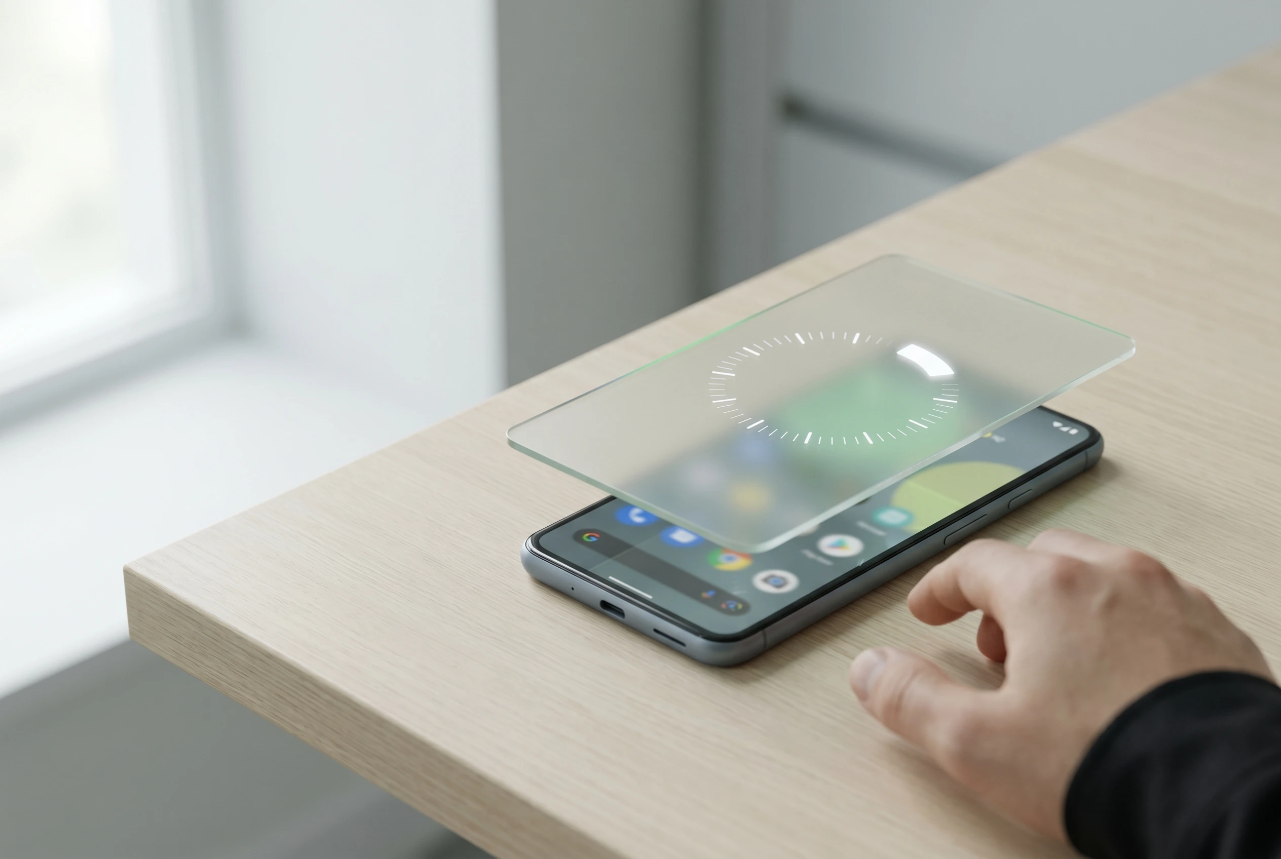
Android 17 Pause Point is Google’s bluntest screen-time move yet: a forced 10-second wait before selected distracting apps open, plus prompts for breathing, favorite photos, an alternative activity or a timer. Google says disabling the feature requires a phone restart, which makes the delay harder to shrug off than a normal reminder.
The feature, announced in the Android Show I/O Edition collection on May 12, 2026, matters because older controls mostly measure use after it starts or block apps on a schedule. This one sits at the tap, where boredom and muscle memory usually win.
A Ten-Second Door at the App Icon
The useful detail in the Pause Point announcement from Google is not that the wait is long. Ten seconds is barely enough time to pour coffee. The point is placement. The feature appears after a user opens a marked app and before the feed, game or inbox gets a chance to load.
That makes it different from a daily cap. A timer fires after the user has already spent the time. A full lockout can feel too strict, so people disable it or never set it up. This feature asks a smaller question: do you still want the app once the reflex has been interrupted?
- 10 seconds is the forced pause before a marked distracting app opens.
- Four diversion options appear in Google’s description: breathing, favorite photos, alternative app suggestions and a timer.
- One restart is required to turn the feature off, according to the company’s post.
That last number may decide whether people keep using it. A restart is not a prison wall. It is a nuisance. In consumer software, that can be enough.
Why Friction Beats Another Dashboard
Digital well-being software has spent years showing users what they already know. You opened the app too often. You stayed too long. You checked the phone when you meant to work. Useful information, yes, but information arrives late when the problem is autopilot.
A randomized smartphone-use intervention study published in JMIR mHealth and uHealth found that a nudge-based intervention reduced problematic smartphone use, screen time and sleep problems against a control group. The broader lesson is simple enough: small changes placed at the decision point can work better than lectures after the fact.
That is why the new Android tool feels more serious than its friendly name. It adds a cost to the opening move. Not a moral scolding. Not a weekly report. Just a short stall before the machine starts feeding the next thing.
For students, that difference can be sharp. A phone can hold flashcards, calendars, banking apps and class notes alongside Shorts, games and Reddit. Our guide to Android apps for study, tasks and saving money covers the productive side of that same device. The hard part is keeping the useful phone from becoming the wandering phone.
Older Tools Still Leave the Fast Exit
Android already has several ways to slow phone use. The Android Digital Wellbeing help page lists app timers, the dashboard, website limits, Bedtime mode and Focus mode. Apple, the iPhone maker, offers similar controls through Screen Time, including Downtime and app limits in the iPhone Screen Time schedule guide.
| Tool | When It Intervenes | Main Strength | Weak Spot |
|---|---|---|---|
| Android App Timers | After a daily limit is reached | Good for hard caps | The user has already entered the app |
| Android Focus Mode | During chosen focus periods | Blocks selected apps and notifications | Can feel too strict outside work blocks |
| Apple Screen Time | During limits or scheduled downtime | Works across app categories and schedules | Still depends on setup and compliance |
| Pause Point | Before a marked app opens | Targets reflexive app launching | Needs users to pick the right apps first |
Focus mode was already a strong idea. Google’s Android Focus mode launch note described it as a way to pause distracting apps and silence their notifications. The gap is the moment outside a planned work block, when a user opens a feed without thinking.
The Restart Requirement Changes the Bargain
The restart rule is the most opinionated part of the feature. Most screen-time tools fail quietly because the off switch is next to the temptation. The user does not need to beat the system. They just need to tap the obvious escape route once.
Requiring a restart changes that bargain in three ways:
- It adds public friction because restarting a phone in the middle of work, school or commuting feels disruptive.
- It separates the urge from the workaround by forcing a larger action than a single tap.
- It preserves user control because the feature can still be disabled without passwords, parental approval or a third-party blocker.
That balance matters. If a well-being feature feels punitive, people avoid it. If it feels decorative, people ignore it. A restart gate lands between those poles. Annoying enough to slow the impulse, reversible enough to remain a personal choice.
Notification controls still matter too. A user can quiet the pings, change app alerts or set custom tones so every message does not feel urgent. For that side of the problem, our walkthrough on custom notification sounds for Telegram on mobile shows how small alert changes can reduce noise. The new wait screen goes after a separate habit: opening the app even when nothing pinged.
The Platform Incentive Problem Is Still There
There is an awkward truth under the feature. The same smartphone platform that wants to protect attention also thrives when apps are richer, faster and more addictive. At the same Android event, the company highlighted Gemini Intelligence, creator tools, Instagram upgrades and better media workflows. The phone is being asked to pull users in and hold them back.
That tension does not make the new feature fake. It makes the design more interesting. Operating systems sit closer to the user than any one social app, so they can add friction at a layer TikTok, Instagram, YouTube, X and Reddit cannot easily control. If the platform owner refuses to act there, the burden falls back on users and third-party blockers.
Still, the company should be judged by defaults, visibility and follow-through. If the setting is buried three menus deep, only motivated users will find it. If the alternative suggestions become another engagement surface, the promise gets muddy. If device makers delay or alter the feature, Android’s open model may blunt the impact.
The most useful version would be boring. Pick distracting apps. Set the delay. Leave it alone. No badges, no streaks, no guilt theater.
Who Should Turn It On First
This is not a universal answer to phone overuse. Some people need stronger limits. Some need therapy, sleep changes, social support or a phone-free room. The word addiction gets tossed around too easily in tech writing, and a software toggle should not be treated as medical care.
For ordinary compulsive checking, though, the first users are easy to name:
- People who open social feeds without remembering why they picked up the phone.
- Students who need the same device for schoolwork and distraction.
- Workers who use Focus mode during office hours but drift at lunch or late night.
- Users who keep deleting and reinstalling blockers because the blocker becomes another project.
- Anyone whose problem app is not notifications, but the thumb path to the icon.
The setup will matter more than the branding. A user should not add every enjoyable app. That turns the phone into a scolding device and invites failure. The better move is to pick the two or three apps most tied to automatic opening, then let the pause do its small, repetitive job.
The Rollout Test Starts in Settings
The unanswered question is how visible the tool becomes once the Android update reaches supported phones. A feature like this can sound persuasive on stage and still disappear if setup takes too long, if the wording feels vague, or if manufacturers hide it behind their own settings layers.
There is also a social test. People like the idea of using phones with intention. They often hate the moment a device refuses instant access. The restart gate will be praised by the person who set it on Sunday night and cursed by the same person on Wednesday afternoon.
That friction is the whole bet. If the company keeps the restart gate and makes setup obvious, this could become the rare screen-time feature that survives contact with boredom. If it softens into another snooze button, the app icons win again.
-
 NEWS10 years ago
Samsung Releases Galaxy Note7 TV Ad as Reddit AMA Leaks Specs
-
 NEWS10 years ago
Android 7.0 Nougat Rolls Out To Nexus Devices With New Emoji, Features
-
 FINANCE9 years ago
Cardano Price Surges as ADA Enters the Crypto Top Ten List
-

 AUTO1 month ago
Tesla’s Roadster Is ‘a Few Weeks Away,’ Says Its Chief Designer
-
 NEWS10 years ago
Pre-Order the First Camera Made for Facebook Live Streaming Video
-
 FINANCE12 months ago
Binance Suspends Trading and Withdrawals for a System Upgrade
-
 FINANCE9 years ago
RChain Price Jumps Nearly 150% to a New All-Time High of $2.03
-
 NEWS10 years ago
Google Play App Icons Get Fresh New Look: See the Latest Design Update