Choosing the right paint color is more than just a design choice; it’s about creating a mood and a backdrop for your life. The colors on your walls can influence how you feel, from calm and relaxed to energized and happy. This guide will help you explore modern and stylish paint color combinations to brighten your home, showing you how to pair different shades to create a beautiful and personalized space.
The Psychology of Color in Your Home
The colors you surround yourself with have a direct impact on your emotions and behavior. This is why so much attention is now paid to the color palette of a home. Bright, warm colors like yellow and orange can create a happy and welcoming atmosphere, while cool colors like blue and green often promote a sense of calm and tranquility.
Understanding this connection is the first step to transforming your house. Think about the purpose of each room. Do you want your living room to feel lively for entertaining guests, or do you prefer a peaceful sanctuary for relaxation? Your color choices are a powerful tool to achieve the exact feeling you want for each space.
Even the shade and tone of a color matter. A soft pastel pink can feel innocent and fresh, while a deep magenta can feel bold and luxurious. By carefully selecting your colors, you are essentially designing the emotional landscape of your home.
Bold and Lively Ideas for Your Living Room
The living room is often the heart of the home, a multi-purpose space where you relax, entertain, and spend time with family. This gives you the freedom to be more experimental with your color choices. You can go for earthy, grounding tones or vibrant, energetic hues. It’s the perfect canvas to let your personality shine.
One surprisingly effective combination is blue and orange. Many people avoid this pairing, thinking it’s too bright for a living space. However, when used correctly, it creates a dynamic and vibrant atmosphere. Imagine a deep navy blue accent wall with pops of burnt orange in your cushions, artwork, and rugs. This balance of cool and warm tones creates a visually stunning and energetic room.
For a softer, more modern look, consider the pairing of pastel green and pink. This duo is perfect for creating a fresh, youthful, and calming vibe. You can use a soft, forest green on the walls and introduce blush pink through your furniture and accessories.
- Accent Wall: Paint one wall in a bold color like forest green or navy blue and keep the others neutral.
- Decor Elements: Use the secondary color in decor items like pillows, throws, curtains, and art to tie the room together.
- Furniture: A statement piece of furniture, like a pink armchair or an orange sofa, can serve as a beautiful focal point.
If you’re aiming for elegance, gray and gold is a magical combination. A sophisticated charcoal gray on the walls provides a perfect neutral background, while gold accents in light fixtures, mirror frames, and decor add a touch of luxury and warmth. This pairing proves that you don’t need bright colors to make a powerful statement.
Creating an Appetizing Atmosphere in the Dining Room
The dining room is a place for sharing meals, laughter, and conversations. The colors here should be cheerful and inviting. Yellow is a fantastic choice because it’s associated with happiness and energy. A bright, sunny yellow can make your dining room feel incredibly welcoming.
If you worry that an all-yellow room might be too overwhelming, you can easily balance it with earthy brown tones. Consider yellow walls paired with a dark wood dining table and chairs or lighter beige curtains. This combination of yellow and brown creates a warm, cheerful, and grounded space perfect for enjoying meals with loved ones.
Another striking combination for a modern dining area is turquoise and tangerine. Both are bright, warm colors that work together to create a vivacious and contemporary look. Picture vibrant turquoise walls complemented by tangerine dining chairs or a statement tablecloth. This bold choice is perfect for those who love color and want their dining room to be a hub of energy and style.
For a more timeless and royal feel, you can’t go wrong with blue and beige. This classic pairing is incredibly versatile and always looks sophisticated. Different shades of blue, from deep indigo to light sky blue, all pair beautifully with a neutral beige. This creates a calm and elegant setting for both casual family dinners and formal gatherings.
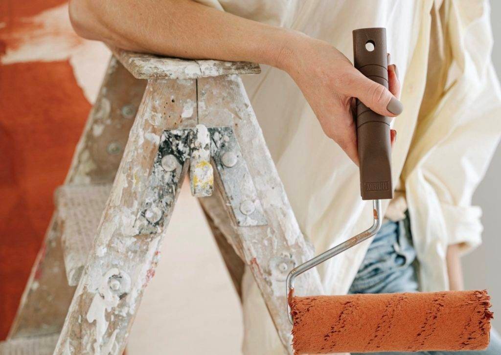
Choosing the Right Paint Finish and Texture
Beyond the color itself, the finish of your paint plays a crucial role in the final look of your room. The right finish can highlight a color, add durability, and contribute to the overall style. Different finishes have different levels of sheen, which affects how they reflect light and how easy they are to clean.
Choosing the correct one depends on the room and its use. High-traffic areas need a more durable, easy-to-clean finish, while low-traffic areas can accommodate more delicate options. The texture of the paint can also add depth and character to your walls, from smooth and sleek to more complex, tactile surfaces.
| Paint Finish | Best For | Characteristics |
|---|---|---|
| Matte / Flat | Bedrooms, Ceilings | No shine, hides imperfections well, less durable. |
| Eggshell / Satin | Living Rooms, Hallways | Low to medium sheen, more durable and easier to clean than matte. |
| Semi-Gloss / Gloss | Kitchens, Bathrooms, Trim | High shine, very durable and scrubbable, highlights imperfections. |
How to Blend Colors in an Open-Plan Space
Many modern homes feature open-plan layouts where the living room flows directly into the dining area or kitchen. This can be tricky to paint, but with a smart approach, you can create a cohesive yet distinct look for each zone.
The key is to use connected shades rather than the exact same color everywhere. You can choose a single color palette and use different shades from it in each area. For example, if your main color is blue, you could use a medium blue in the living room and a lighter, paler blue in the dining area. This creates a subtle visual separation while maintaining a harmonious flow.
Another technique is to use a neutral color for the majority of the walls to unify the space. Then, you can add a bold accent wall in the living room and a different, complementary accent wall in the dining area. This method defines each zone without making the space feel choppy or disconnected.
When to Call in a Professional Painter
While DIY painting can be a rewarding project, there are times when hiring a professional is the best decision. If you’re undertaking a large-scale makeover, dealing with complex architectural details, or simply lack the time and experience, an expert can make all the difference.
Professionals have the right tools, skills, and expertise to ensure a flawless finish. They handle all the prep work, which is often the most time-consuming part, and know how to deal with any issues that may arise. Hiring a professional ensures your investment in quality paint results in a beautiful, long-lasting finish that truly transforms your home. They can also offer valuable advice on color choices and finishes that best suit your space and lifestyle.
Frequently Asked Questions about Interior Painting
What are the best paint colors to make a small room look bigger?
Light and neutral colors like off-white, light gray, pale blue, and soft beige are excellent choices. They reflect more light, creating an illusion of space and making the room feel more open and airy.
How do I test a paint color before committing to the whole room?
Always buy a sample pot and paint a large swatch on the wall or on a piece of poster board. Observe the color at different times of the day, as natural and artificial light will change its appearance significantly.
Can I mix warm and cool colors in the same room?
Yes, mixing warm and cool colors can create a balanced and visually interesting space. The key is to choose one dominant temperature and use the other for accents, as seen in the blue (cool) and orange (warm) combination.
What is the 60-30-10 rule in interior design?
This is a classic design guideline for creating a balanced color scheme. 60% of the room should be a dominant color (walls), 30% a secondary color (furniture, curtains), and 10% an accent color (pillows, decor).
Which paint finish is best for high-traffic areas like living rooms?
An eggshell or satin finish is ideal for living rooms and hallways. These finishes have a slight sheen, making them more durable and easier to wipe clean than a flat or matte finish, which is better for low-traffic areas.


Leave a Comment